Skip to content

Public data, made explorable

Data visualisations.

I use public datasets to look for patterns and make the underlying evidence easier to inspect. Every visual includes its source, coverage and method.
Available visualisations

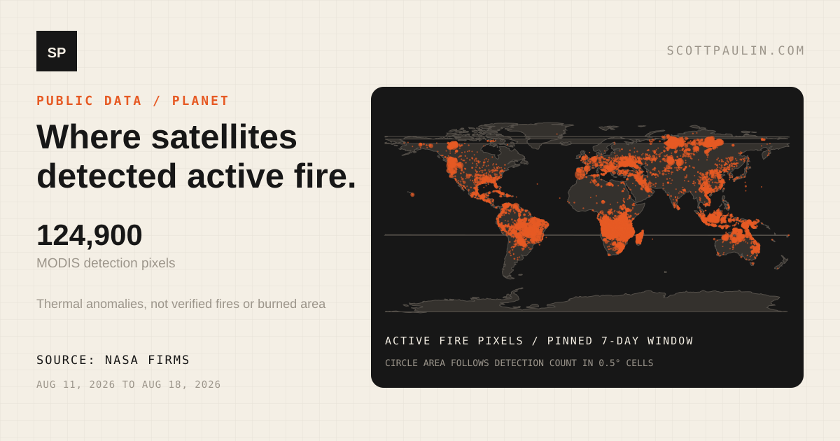
  • World map of NASA MODIS active fire detection pixels in a pinned seven-day window
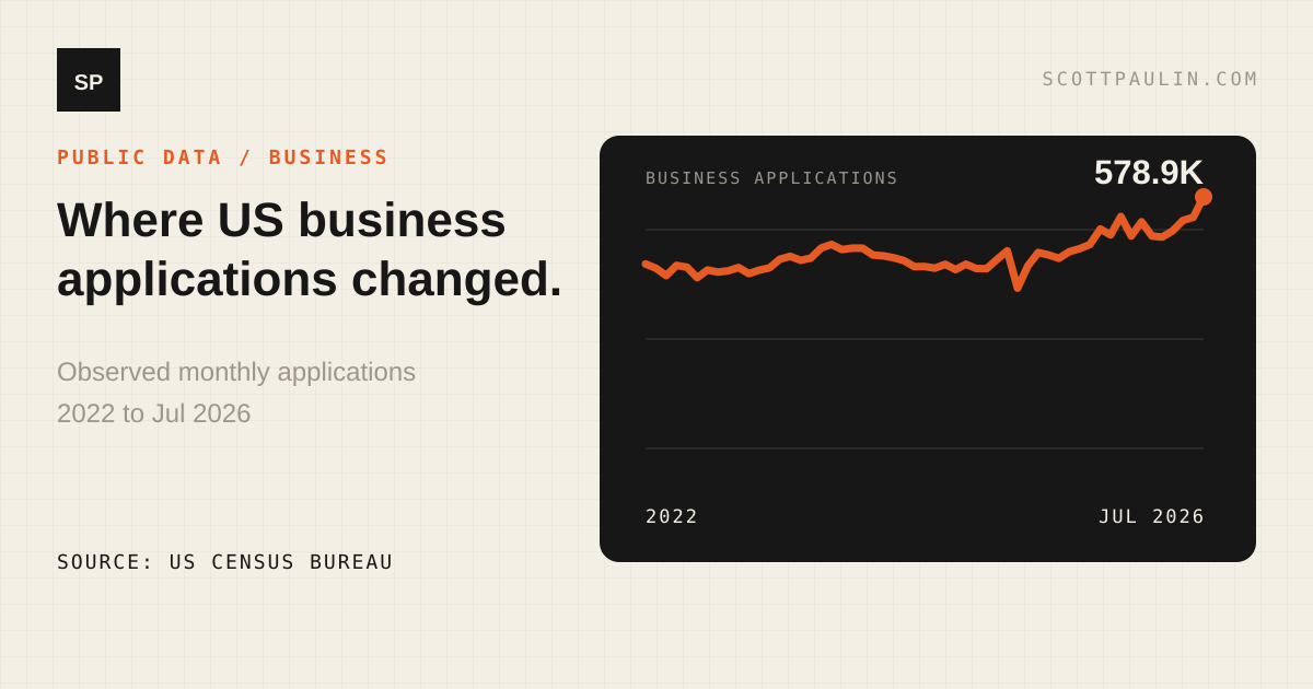
  • Observed US business applications by place, industry and application category from 2022 to 2026
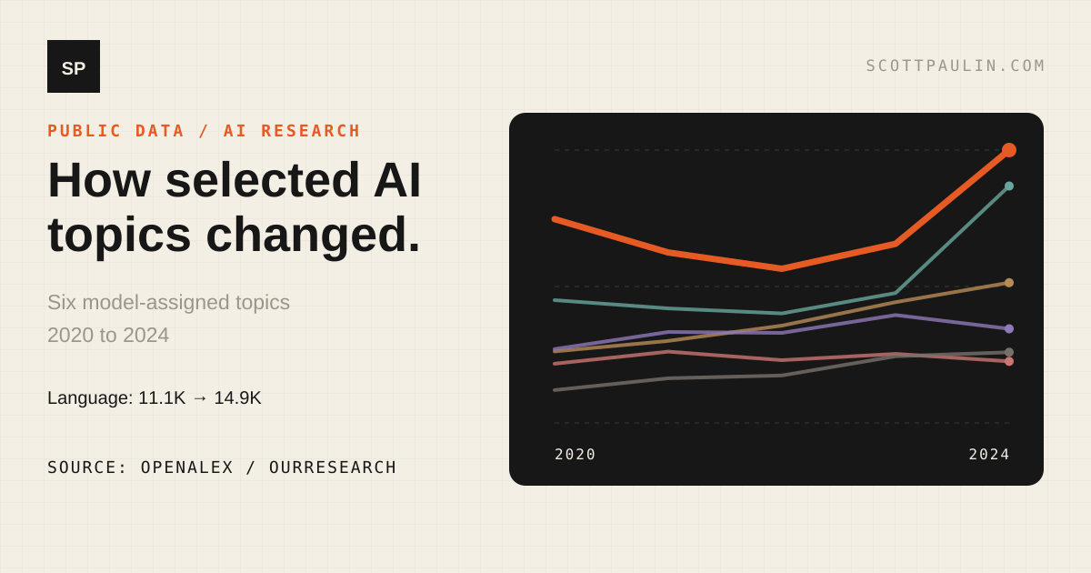
  • AI research publication patterns across model-assigned topics, countries and institutions from 2020 to 2024
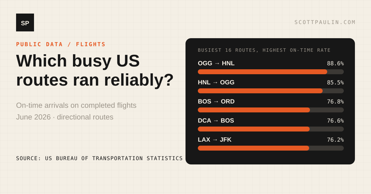
  • Reported on-time performance for busy US airline routes in June 2026
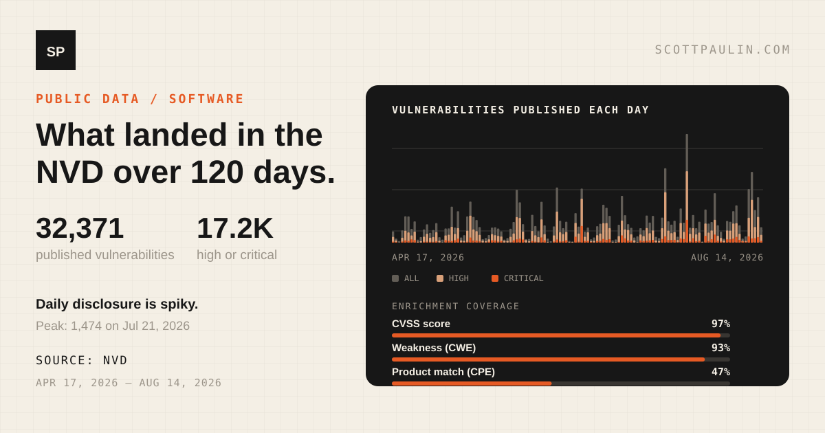
  • Recent NVD vulnerability disclosures compared by severity, weakness and enrichment coverage
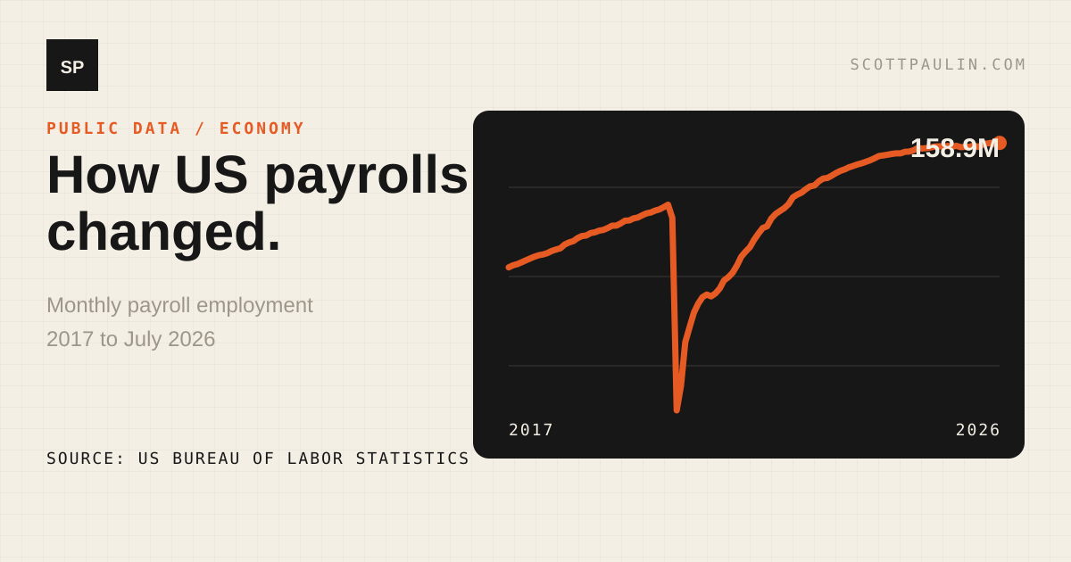
  • US payroll employment from 2017 to July 2026, with the sharp 2020 fall and subsequent recovery
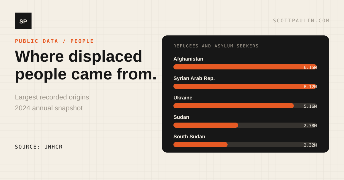
  • Bar chart of the five largest recorded origins of refugees and asylum seekers in 2024
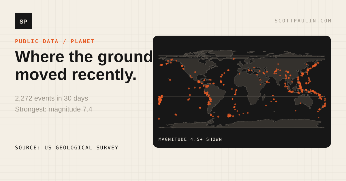
  • World map of 2,272 earthquakes recorded over 30 days, with magnitude 4.5 and greater events shown